
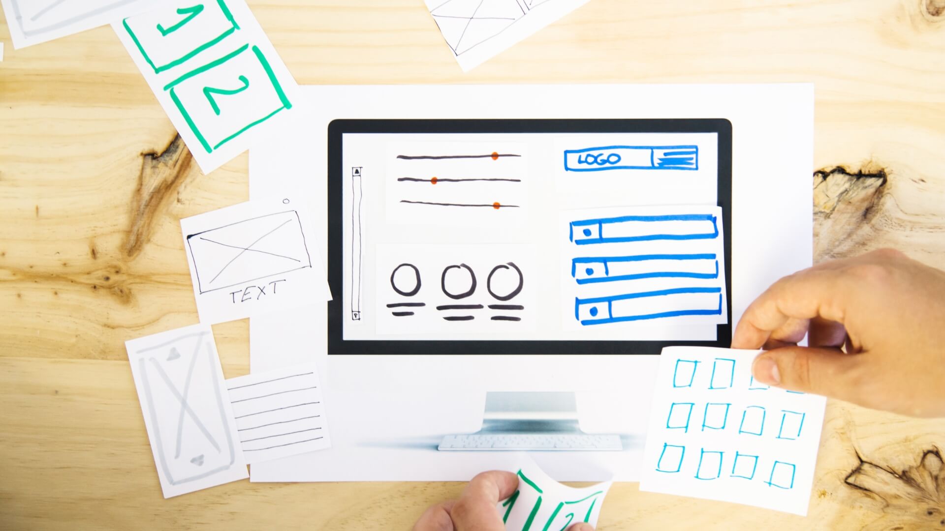
Your landing page is crucial to how your business is seen by your potential clients. A poorly designed landing page will instantly send visitors away but a well designed page will turn them into buyers. Take a look at the following tips in order to create a superb landing page.
Be direct
People need to see the offer or incentive as quickly as possible and so, that is one thing to consider when developing your landing page. When viewing a website, they do not want to read through lots of text and they will scan the screen to see if the information they want is present.
Therefore, make sure that you make it clear as to why they came to your site, show them what you are offering and how you can meet their needs.
Put text in a logical format, use clear headers and sub-headers and emphasise key points but remember to be brief.
Use different colours
Your landing page will need to have a call-to-action that really jumps out at your visitors. Therefore, it is important to make sure that forms are simple to complete. This is where contrasting colours make it easier to grab the attention of your visitors in order to guide them to where they want to go.
Get your logo out there
Your logo is your brand and that means it is your business. All landing pages should have a logo correctly placed that helps people understand that the landing page belongs to your business. This is very important for those visitors who come to your site from an external source. So, it is good practice to place it in the same location as the other pages on your site.
Don’t go crazy on the clutter
It can be exciting to think of your website with many different visuals playing a part on your landing pages but this is not really what you want. It is too easy to go over the top with too many images and doing so will turn people away.
Too much clutter can distract the reader from what your landing page is trying to achieve and of course too many images can cause the page to load slowly. Ideally the complete page should be viewable within 2 seconds or less. You want to create a simple pathway to conversion, so remember to keep things clear and concise.
Formatting is key
This is a simple practice that can make the world of difference to your landing pages. It is also easy to get right without having to put in a lot of effort. What you offer can be highlighted with a clear layout which will create an experience that enables the reader to easily complete the conversion process.
Use social media as proof
You may be wondering what this is all about but you need to add some form of credibility to your landing page. Case studies or testimonials will work brilliantly and using social networks such as Twitter and Facebook further enhance credibility.
If you embed tweets or posts from those people who have used your service or have said something good about an aspect of your business, then readers will believe that you are who you say you are. You may have an offer that has been taken up by a specific amount of people – if so, make it known just how many people have taken up your amazing offer!
Consistency is vital
It is well known that the layout of a page has a massive impact on conversion rates.
Therefore it is crucial to regularly test certain aspects of your page but remember not to make drastic changes. If your landing pages are consistent they will give your visitor that sense of familiarity each time they visit.
Oh and that submit button!
Time and time again I come across landing pages (and contact forms) that use the word “submit” as a call to action.
Words like this are known as high friction words and imply that your visitor has to perform a chore. Better examples would be “Get it Now” or “Get your FREE Quote” which actually describes what happens after your visitor has clicked your button.
For more information on our services, contact us here www.virtualeap.com/contact
Article by Danny Smith | Virtualeap